Country
Canada
Project Type
UI Design Case Study
My Role
UX Research, UI Design
Tools
Adobe Illustrator, Photoshop, Adobe XD
Canada
UI Design Case Study
UX Research, UI Design
Adobe Illustrator, Photoshop, Adobe XD
Molson Gold is a beer brand and Web Design Project created for the Interact Media Design program at Fanshawe College.
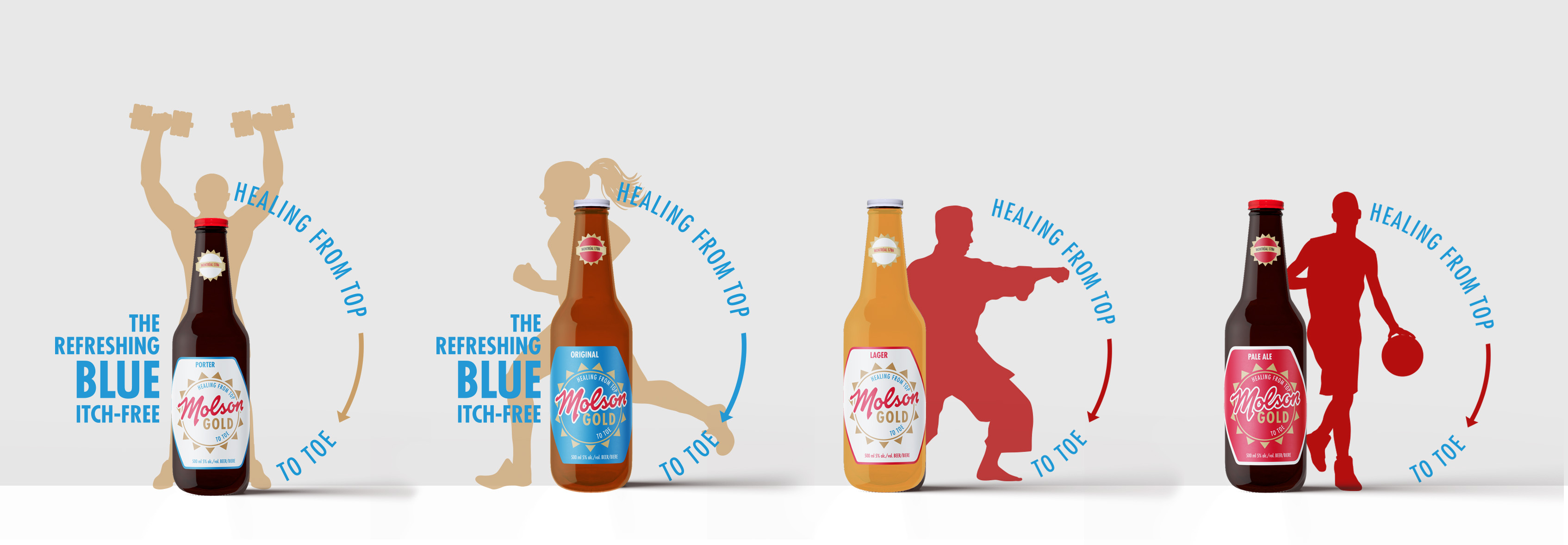
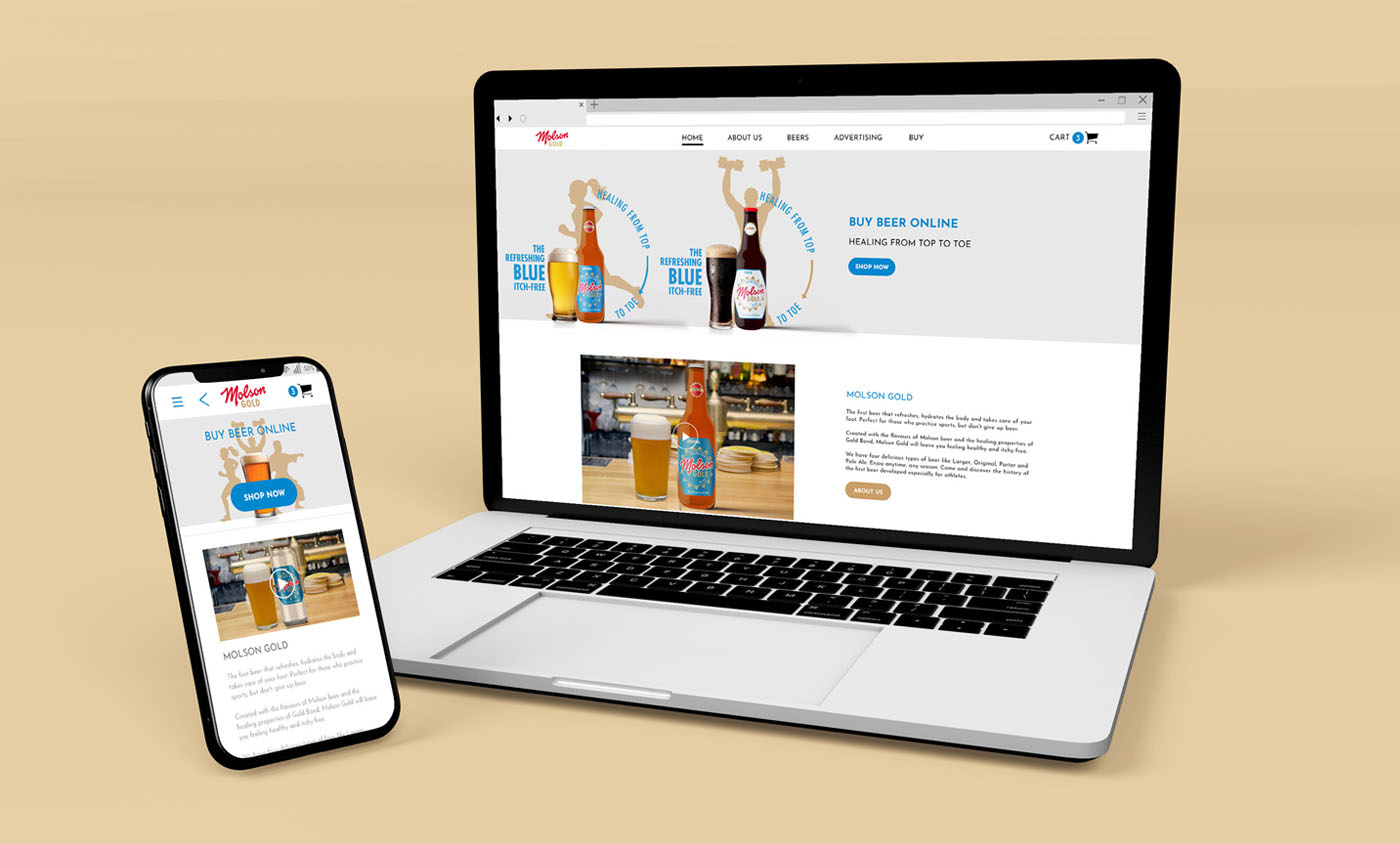
Molson Gold is an ecommerce website of the first beer that refreshes, hydrates the body and takes care of your foot. Perfect for those who practice sports but don't give up beer. Created with Molson beer's flavours and the healing properties of Gold Bond, Molson Gold will leave you feeling healthy and itchy-free.
1. Create a logo and visual identity combining visual references of the two brands.
2. Make up a story about why a brewery and a foot powder brand created a unique beer brand.
3. Produce a responsive web design and style guide for the two prototypes.
4. Introduce the new brand to sportspeople and athletes.
5. Make ecommerce web pages to sell the beers.

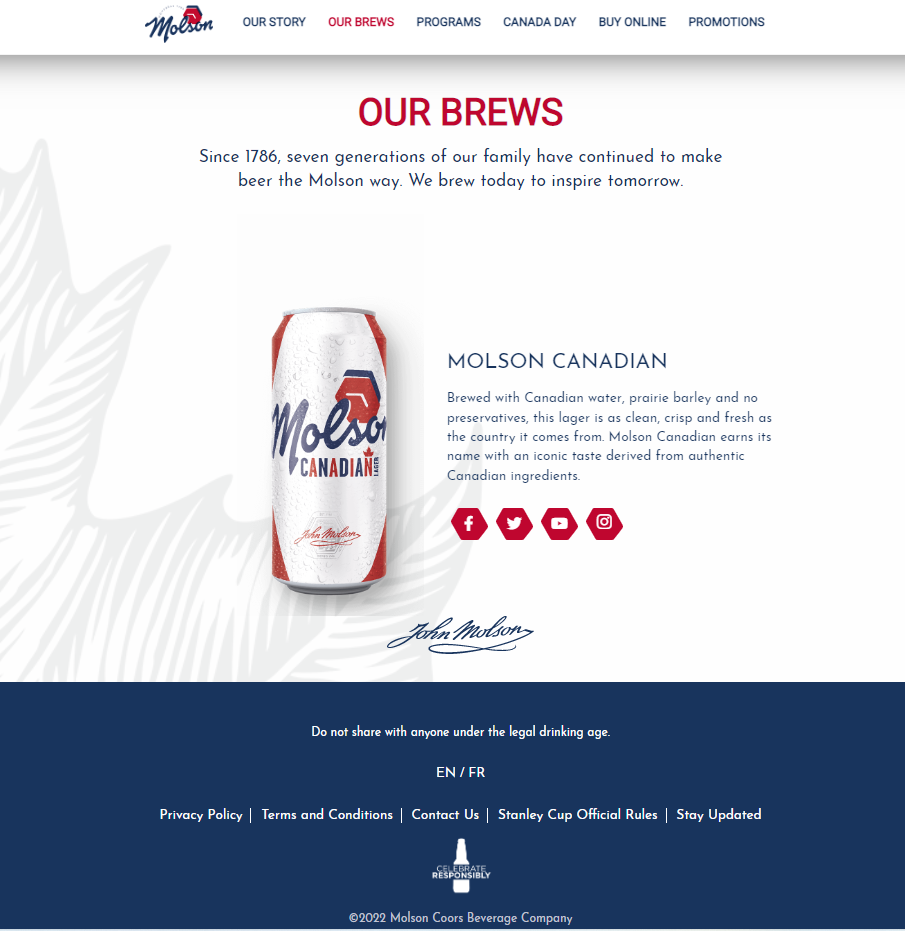
The Molson Brewery is a Canadian brewery and beer company based in Montreal, formed in 1786 by the Molson family. In 2005, Molson merged with the Adolph Coors Company to become Molson Coors.
Introduced in 1908 to local customers, Gold Bond is a brand of over-the-counter skin care products produced by Chattem of Chattanooga, Tennessee. Now the brand is a subsidiary of the French pharmaceutical company Sanofi. It is available as both a powder and a topical cream. Gold Bond is used to curbing moisture, control odour, and soothe minor skin irritations, notably jock itch.
Using the proto-personas technique, we created the profile of our users, which were validated and modified after quantitative and qualitative research. We utilized the Pixar Storytelling method to exemplify how such personas behave and to create empathy with the personas.
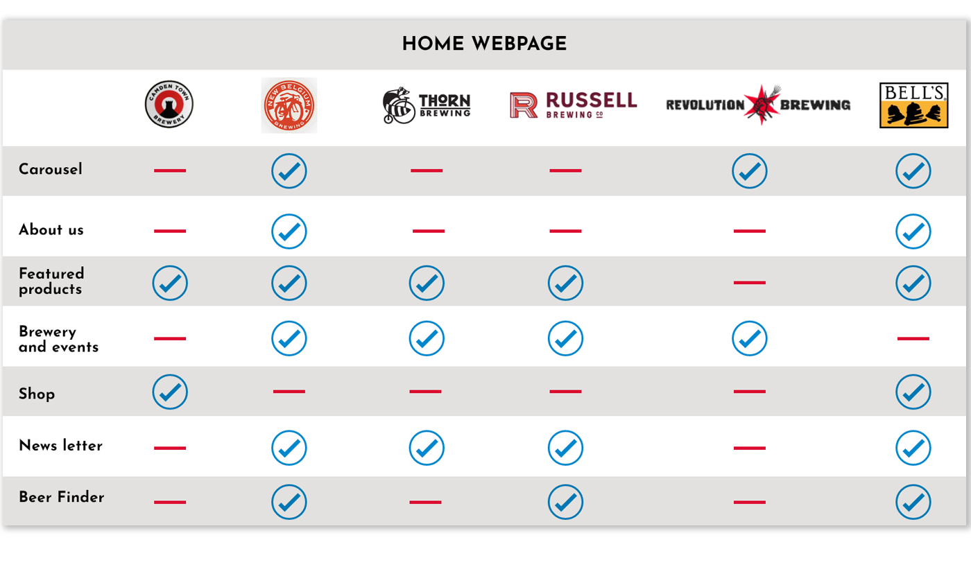
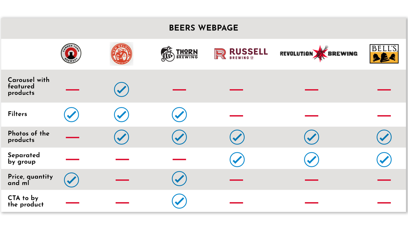
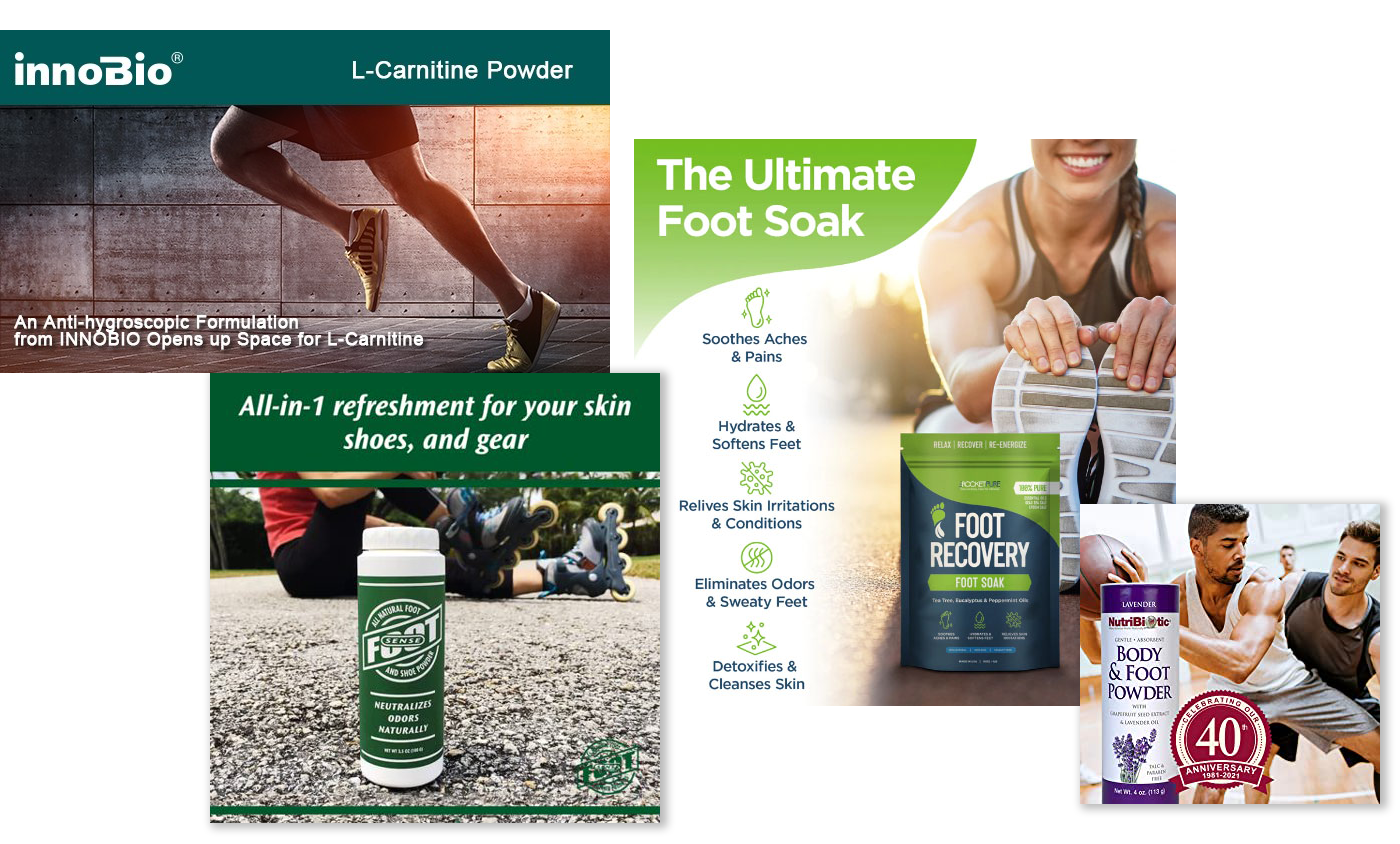
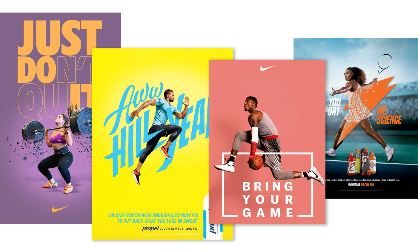
This website was a college project, and it had some requirements:
1.Minimum of 6 web pages: Home, About, Products and Promotions, Advertisements, Contact and Purchase, Our Team
2.Two videos on the advertisement page
3.Product details on the beer page
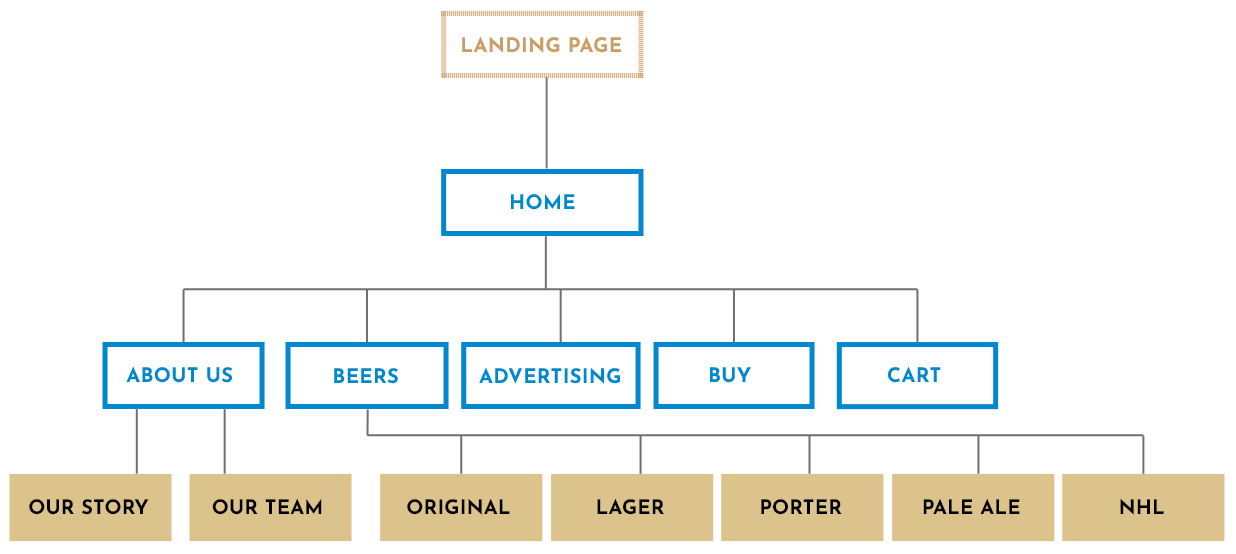
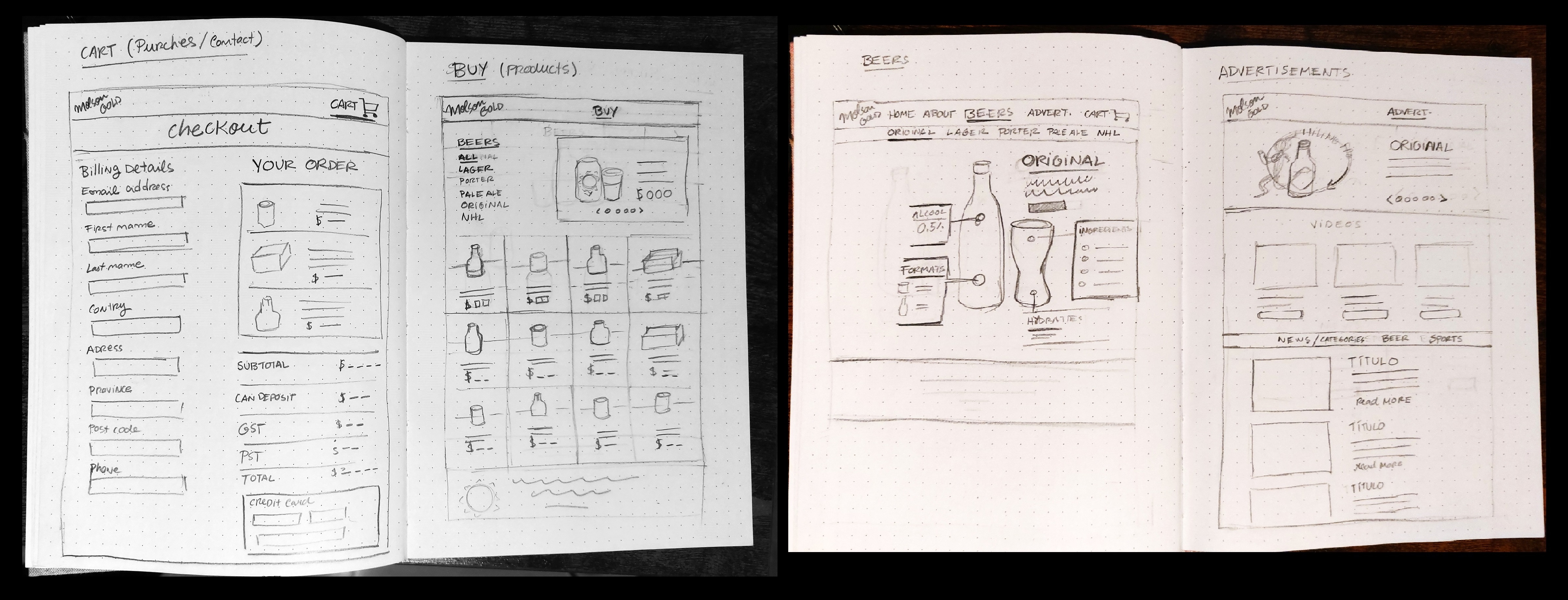
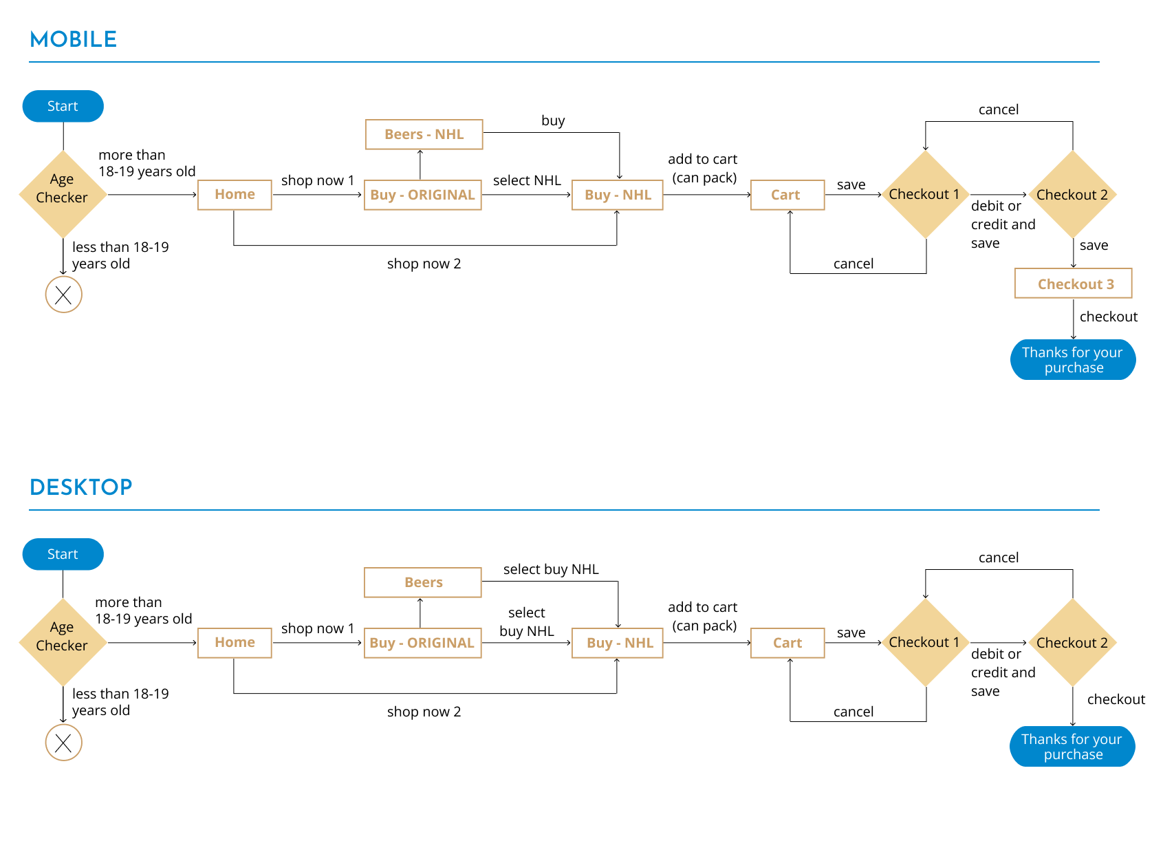
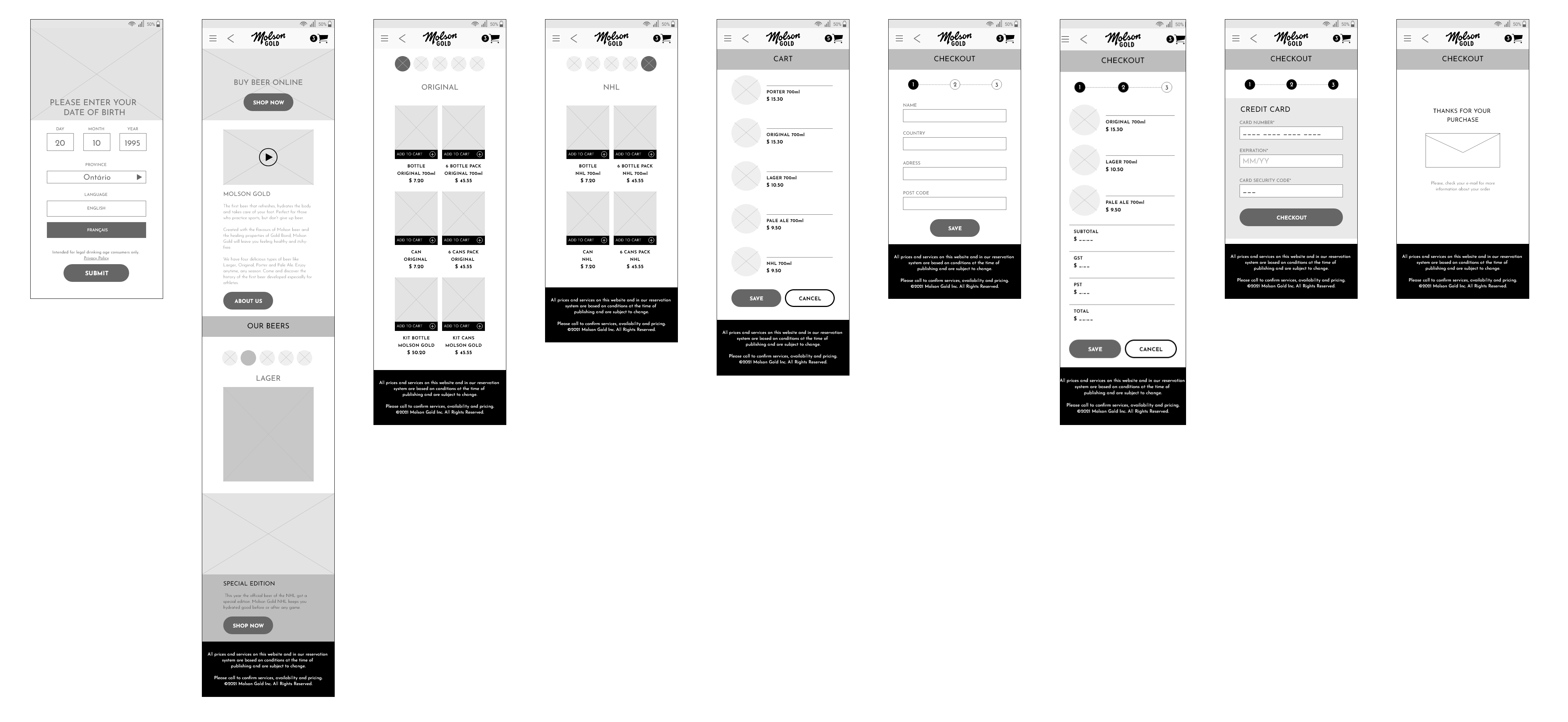
The first step in creating the wireframes was the sketches. In this initial phase, I draw thinking about all the project requirements. The second step was to make the user flow according to the tasks, and then design the Low-fidelity wireframes in Adobe XD. Some components I created to ensure the success of the three assignments.
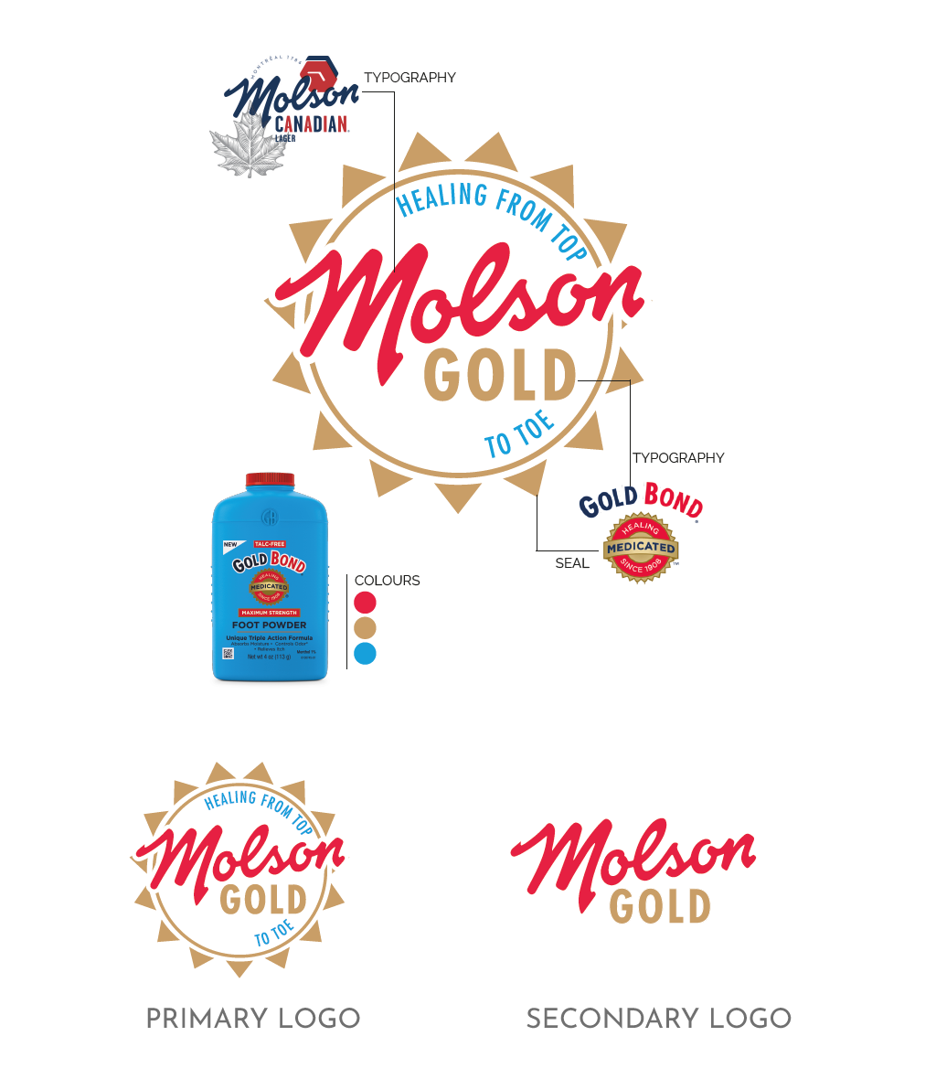
The Logo combines the names Molson and Gold from Gold Bond. The typography is from each brand. The circle and the triangles have the Gold Bond emblem as a reference. Healing from top to toe expression emphasized the healing properties of the beer not just for the foot but how our product does not dehydrate the body like other beers.
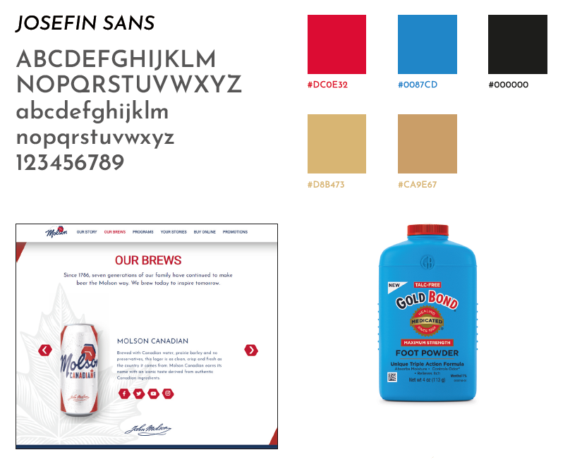
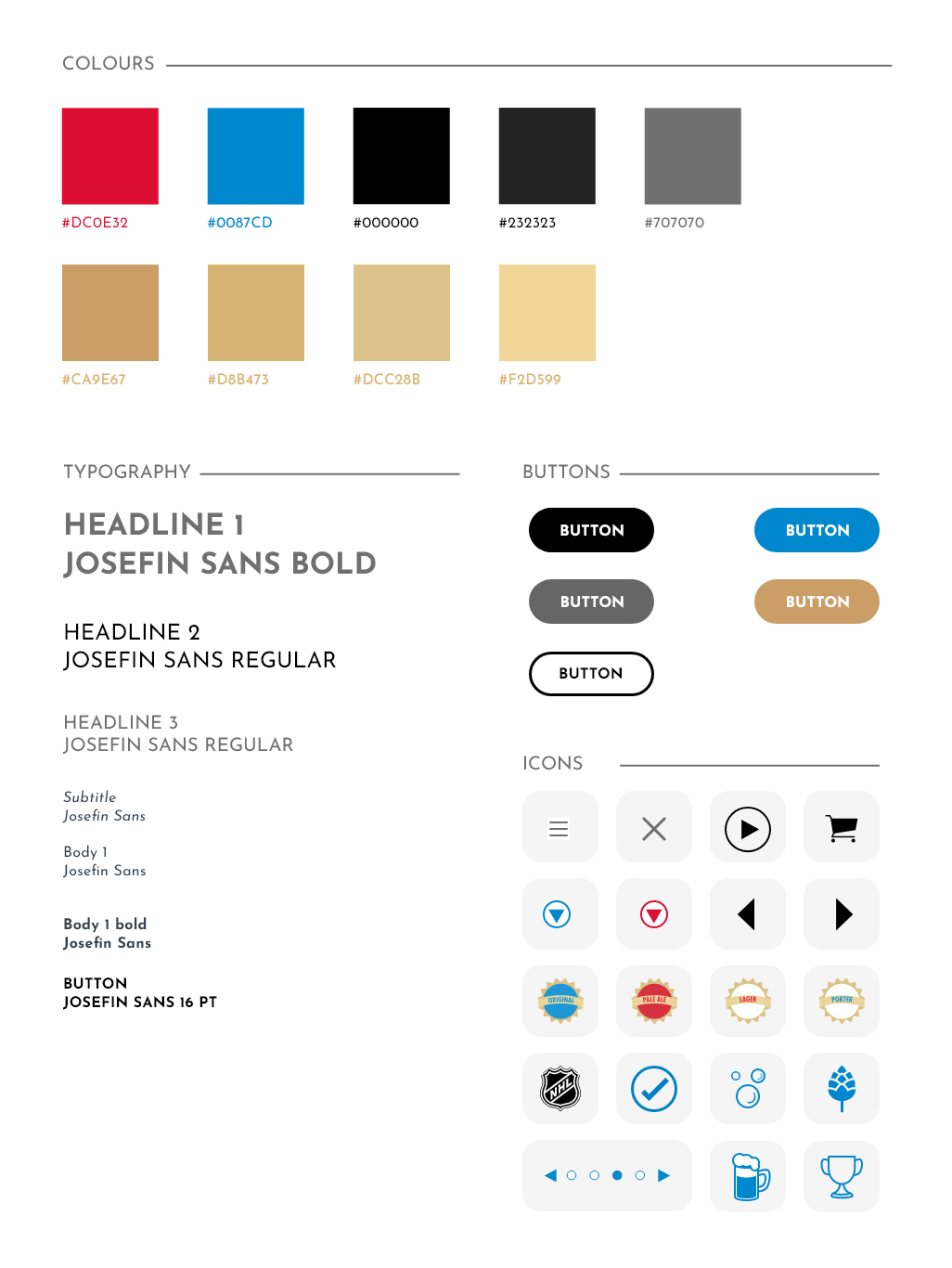
The typography chosen for the website is the same used on the Molson Brewery website. All colours have Gold Bond as a reference, the red and gold of the stamp and the blue from MAXIMUM STRENGTH FOOT POWDER's bottle.
