1. Brief
Our business goals
• 40% of new users (patients) schedule at least two appointments in the first month while using the app.
• Increase by at least 20% the number of patients for newly registered psychologists within three months.
• Increase by 10% the number of psychologists who use the platform to organize their schedule, payments, and records within three months.
Due to the absence of an initial baseline, metrics, and deadlines will be reviewed and adjusted.
How did we come up with these goals?
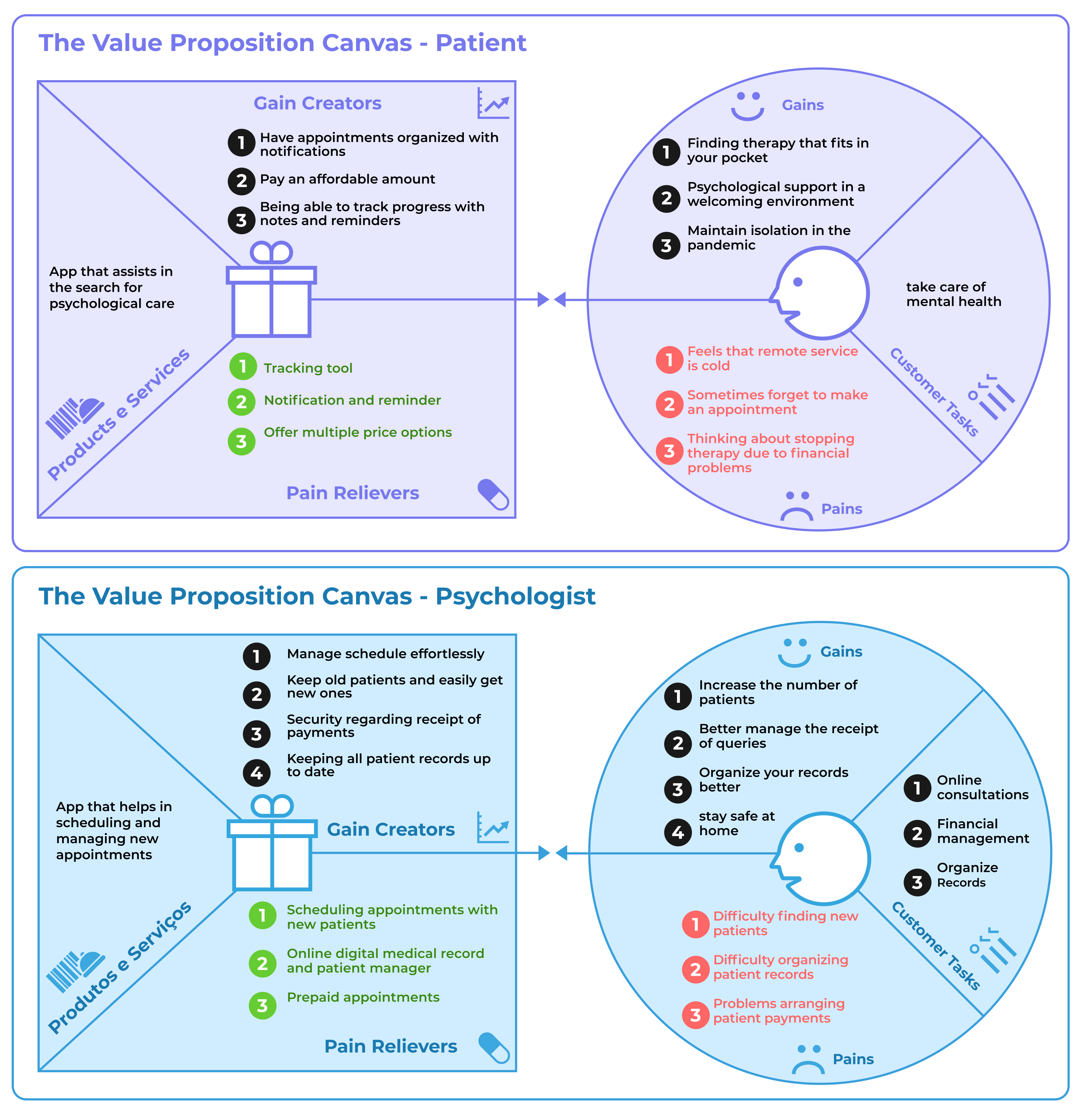
Desk research provided us with an overview of how online therapy works in Brazil. However, we needed detailed information, so we did user surveys — (which we will present later) — and we identified the main goals and expectations of patients and psychologists using the Value Proposition Canvas.
Context
For more information about the desk research see the links below:
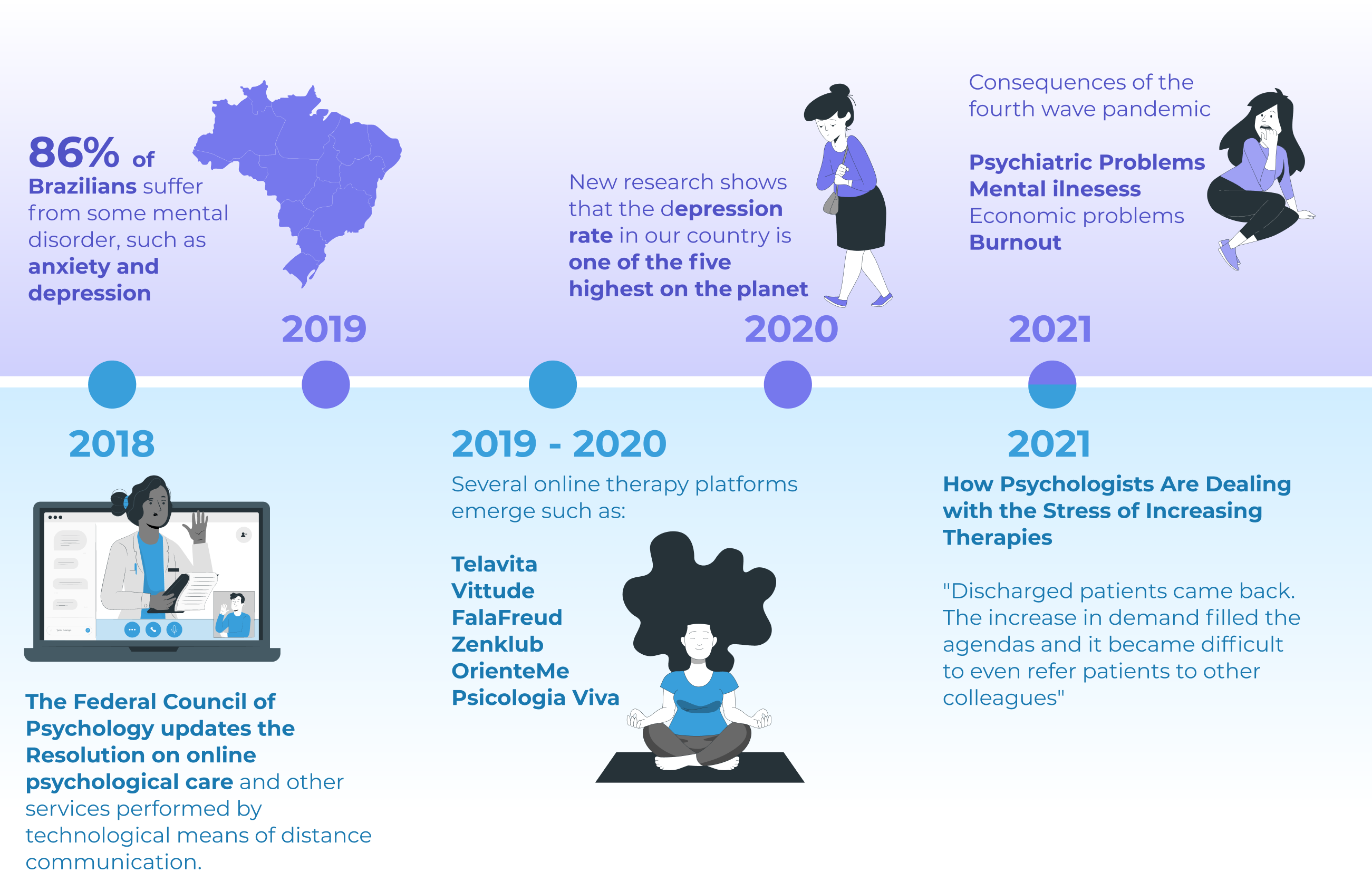
Research shows that 86% of Brazilians have some mental disorder
Brazil has the highest rate of anxiety disorder in the world, says World Health Organization
COVID-19: mental health has worsened for 53% of Brazilians under a pandemic, research shows How psychologists are dealing with the stress of increased therapies
Online therapy, authorized by the Federal Council of Psychology in 2018
How psychologists are dealing with the stress of increased therapies
2. Research
User Profile
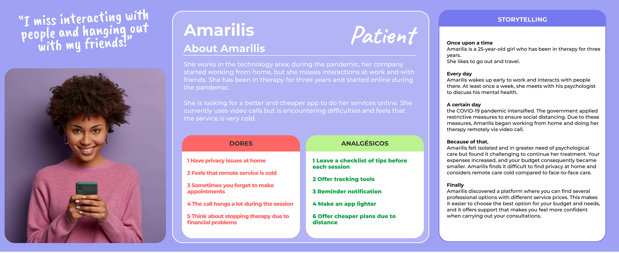
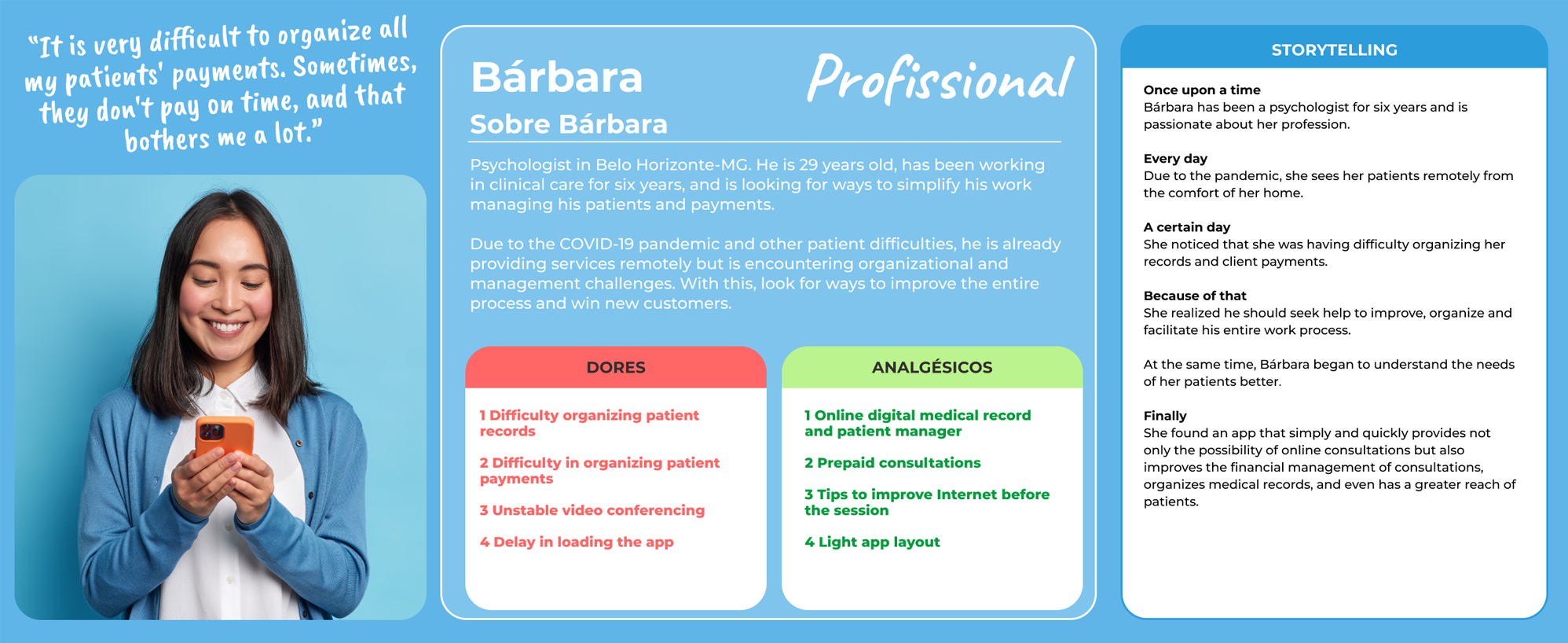
Using the proto-personas technique, we created the profile of our users, which were validated and modified after quantitative and qualitative research. We utilized the Pixar Storytelling method to exemplify how such personas behave and to create empathy with the personas.
First validation step
After the proto-personas and the journeys, we created a matrix with Certainties, Suppositions & Doubts (CSD Matrix) with the characteristics and difficulties of these users.
From it, we built two questionnaires, one for the patient profile and another for the psychologist profile. These surveys validated some assumptions, but many responses changed our opinions of how our users thought. The qualitative research helped us to understand some details about the profiles. For this reason, we use the two surveys as a basis to make updates to personas, journeys, and storytelling.
3. Insight
Journey
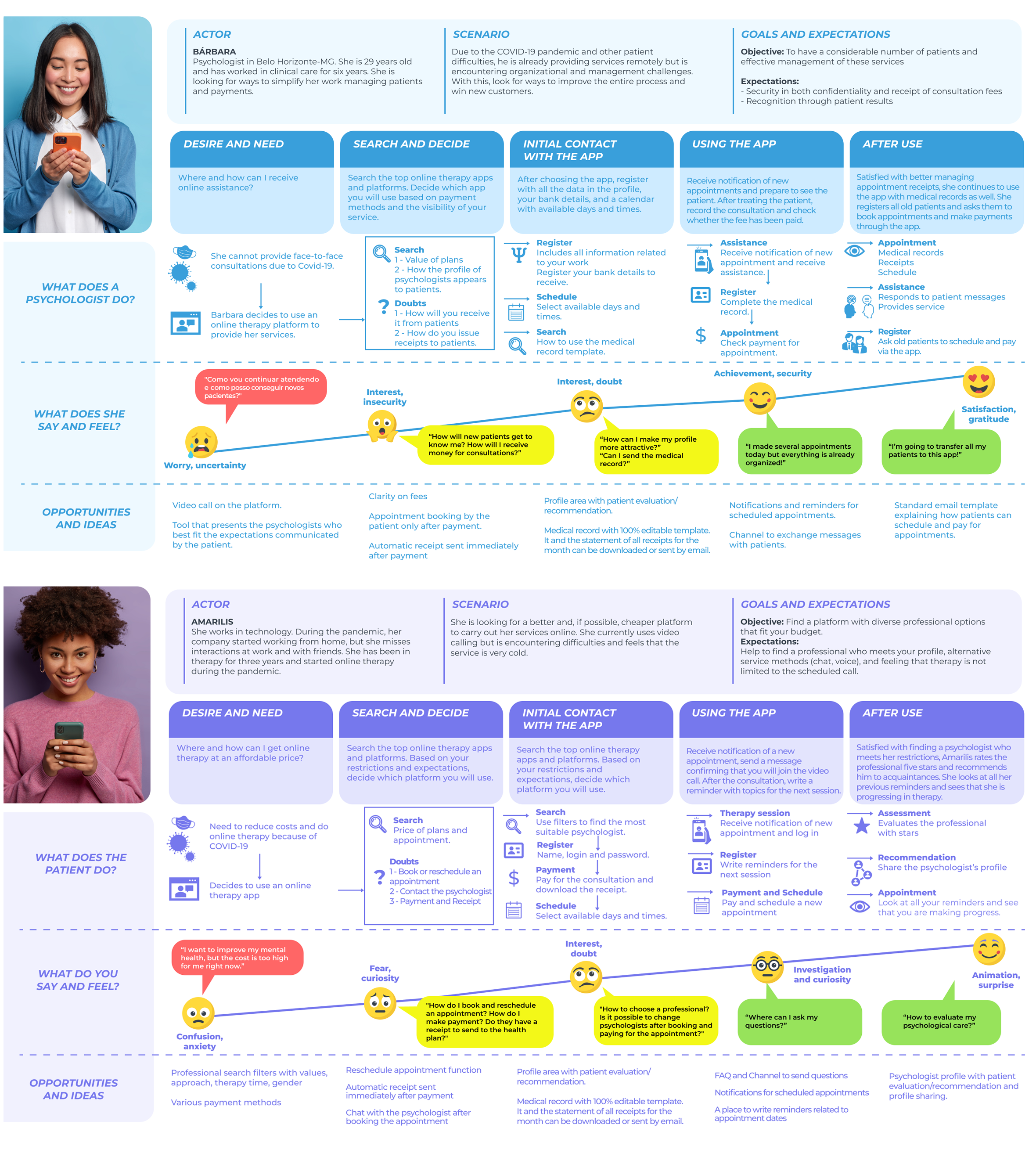
After defining the personas, we move on to building maps of the journey of patients and professionals, aiming to understand the motivations and processes behind each stage. In this way, we find possible adaptations and new opportunities.
4. Hypothesis
Solution alternatives
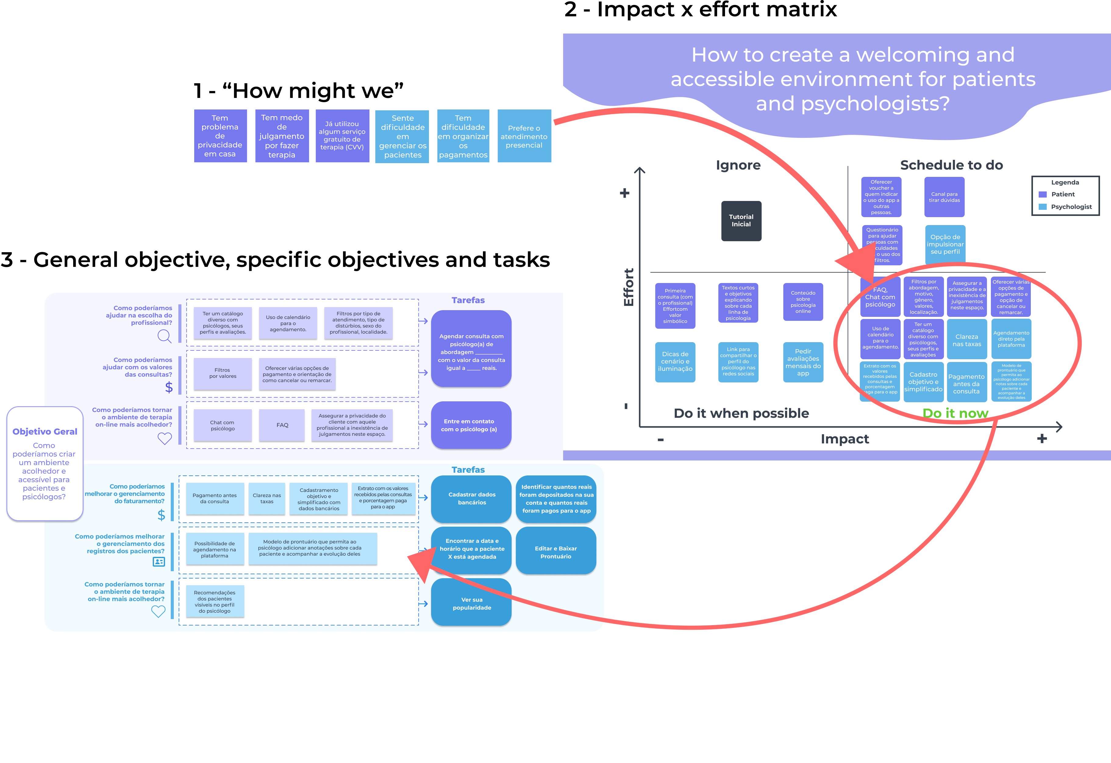
After the research stage, using the “How might we” technique, we identified a general objective for the project and specific objectives for patients and psychologists. We seek possible solutions to the problems presented in the questionnaires and interviews through these objectives.
The next step was to select the alternatives that have more impact with low effort among those listed. Then set up two matrices (patient and professional) with the solution alternatives and categorize them according to the feasibility of implementing each one.
5. Ideation
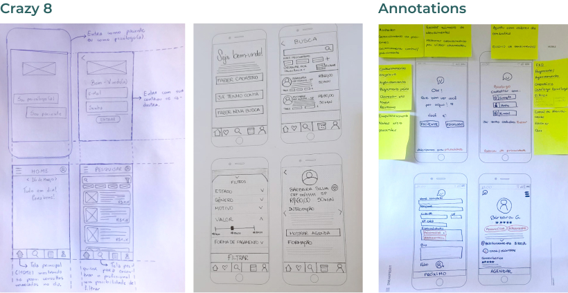
Sketch in 4 Steps
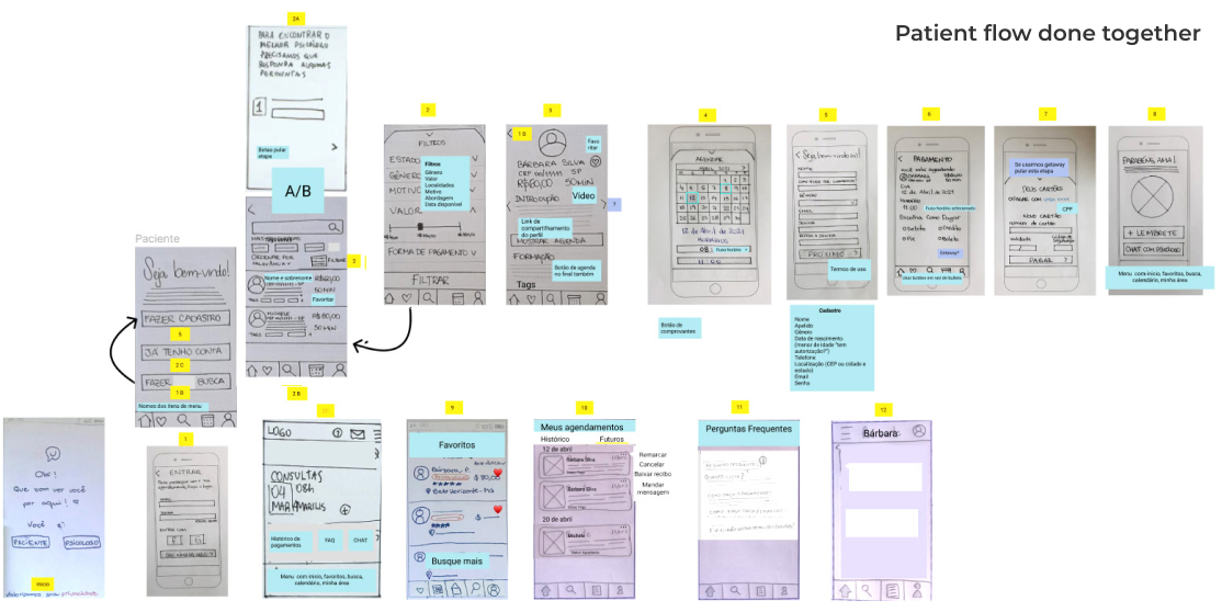
To design the wireframes, we applied sketching techniques in 4 steps (Annotations, Free Drawing, Crazy Eight and Prototype). Everyone on the team did draft individually, then we got together to develop the first user flow and write down any adjustments we needed to make.
6. Prototype
Low-fidelity prototype
After reviewing the drawings, we made our prototype in the Marvel app and tested it with two people. The main issue appeared when a participant started the task from the register. The number of fields and the payment screen right after registering annoyed the user. We solved this problem by limiting the initial registration to login and password and replacing the payment after choosing the day and time with the psychologist.
Paper prototype link:
https://marvelapp.com/prototype/g5h1fi4/screen/77825270Medium-fidelity prototype
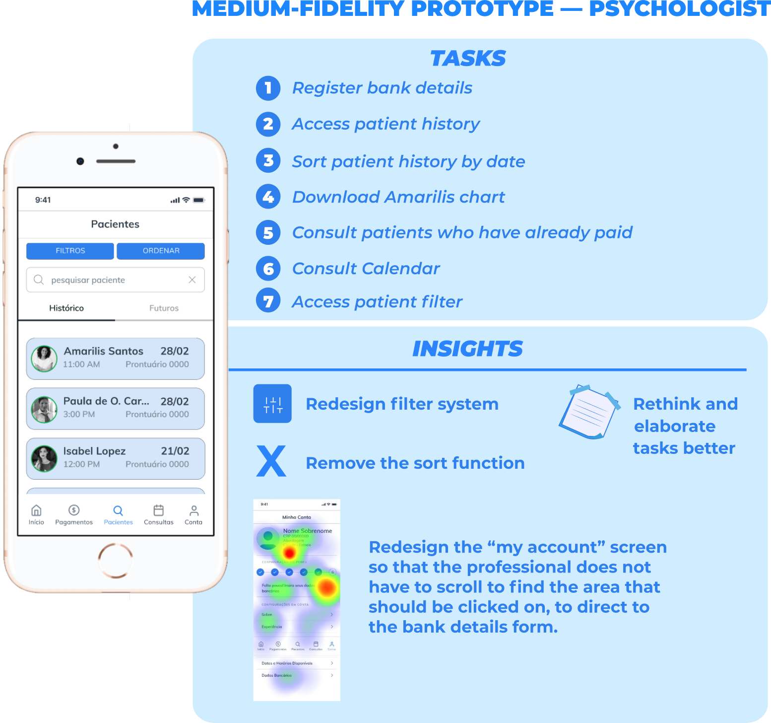
At this stage, we made two prototypes, one for each profile, and tested with two people on each prototype. We use the “Watch for” table to analyze the tests. The usability testing carried out with psychologists showed that the difficulty of finding the banking information fields was the biggest problem of the prototype. We solved this problem by redesigning the “my account” screen, so the professional would not have to scroll to find the area that should be clicked on, thus directing him to the bank details form.
Medium fidelity patient prototype:
https://t.maze.co/33477224Prototype of medium-fidelity psychologist:
https://t.maze.design/33467519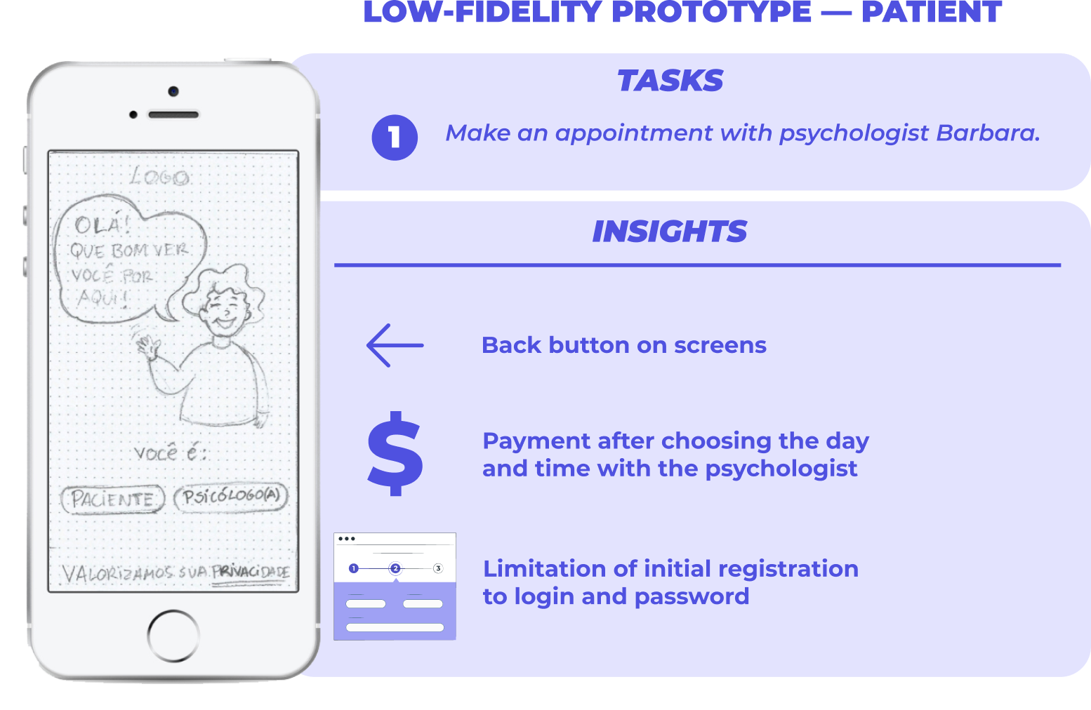
7. Solution
Wireframes and User Flow
After analyzing user difficulties in low and medium fidelity prototypes, we made other changes while developing high fidelity wireframes and user flows.
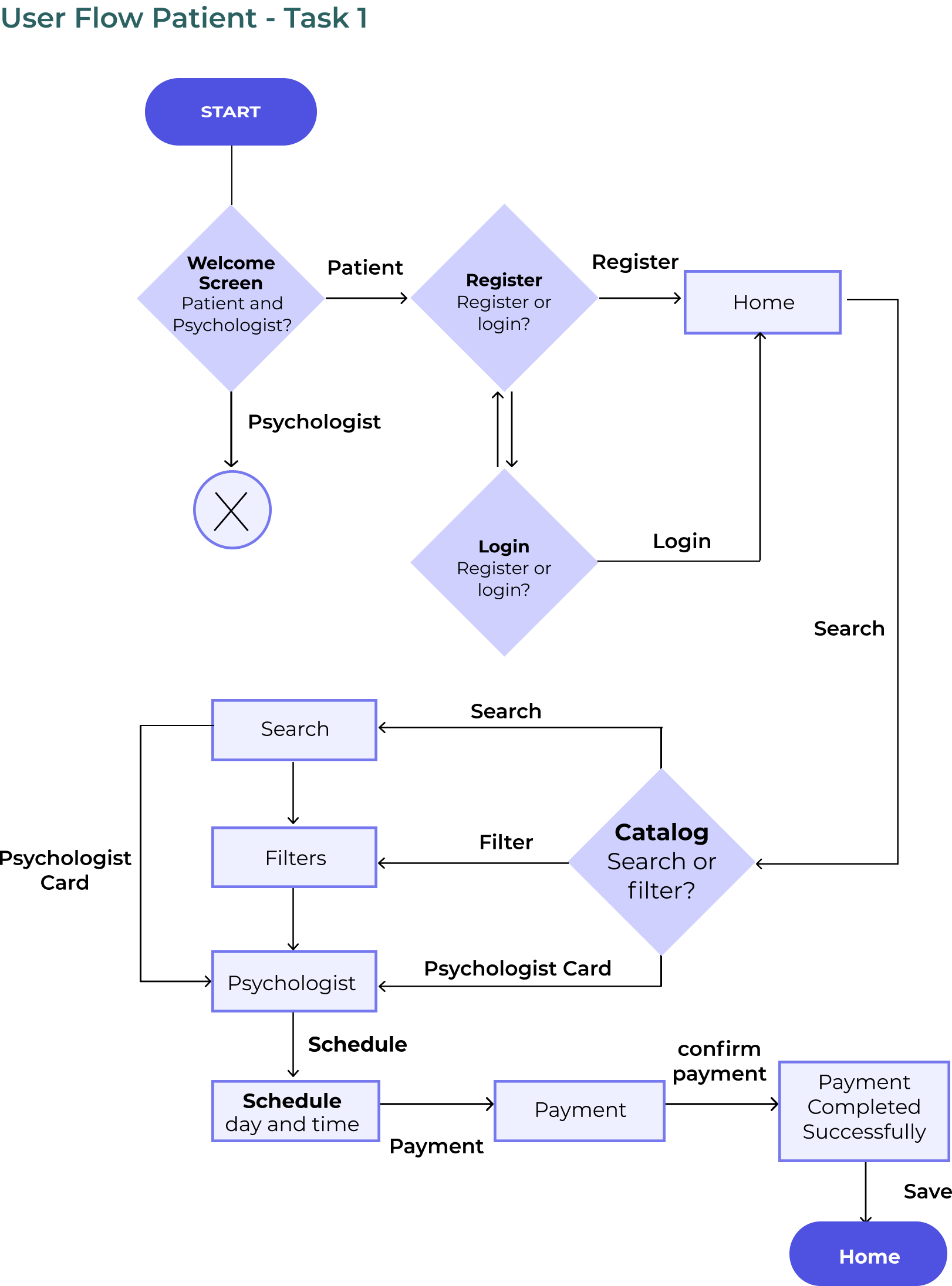
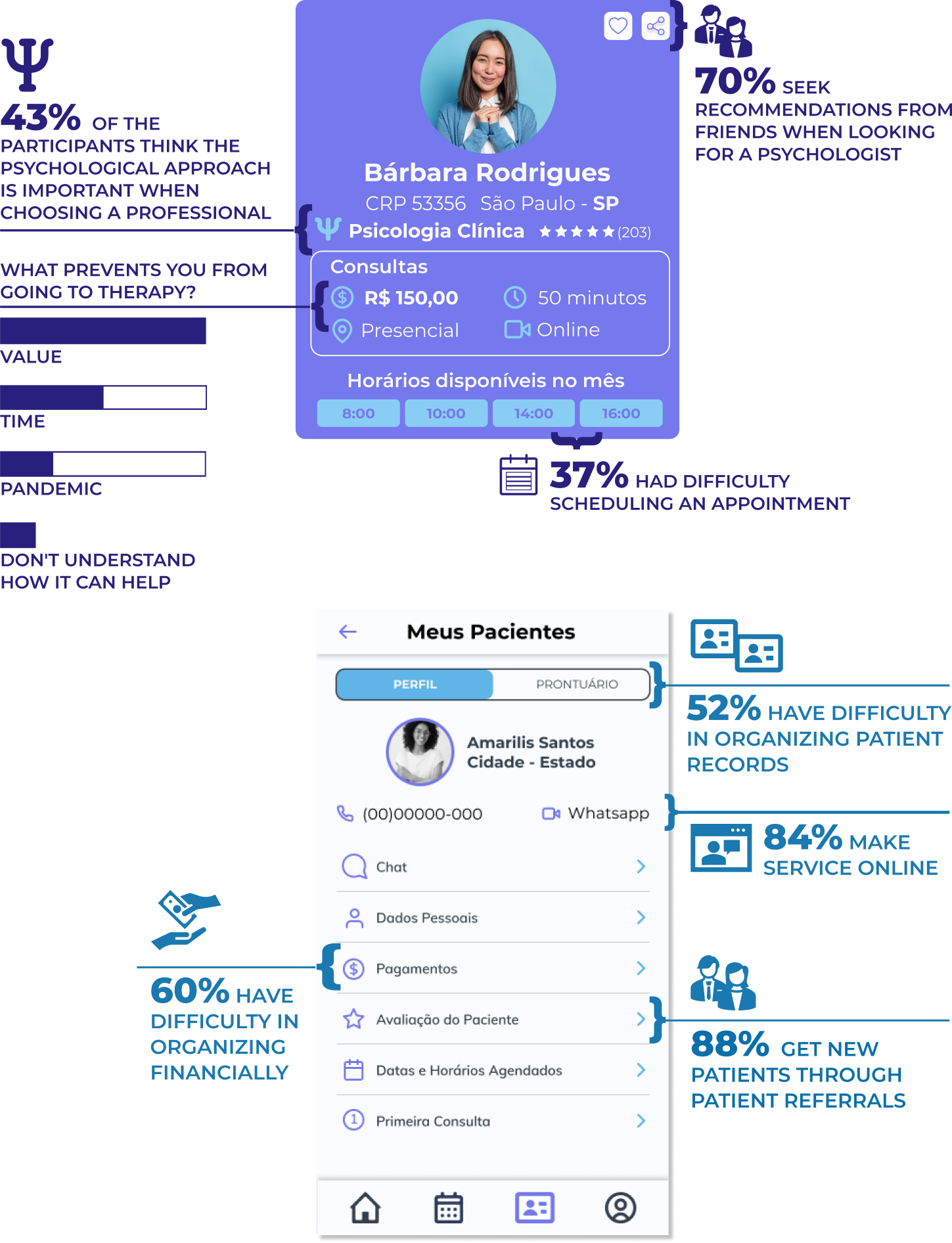
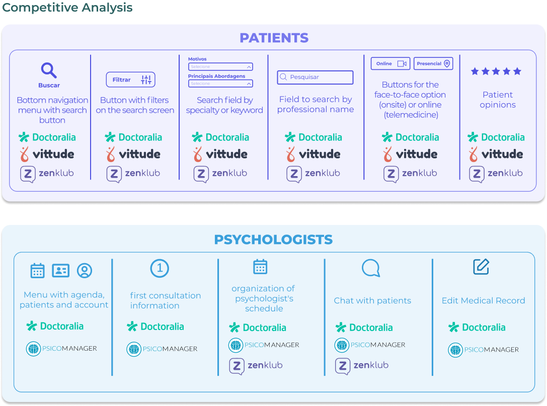
High-Fidelity Prototype
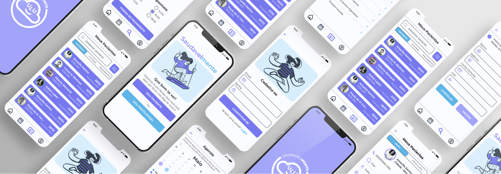
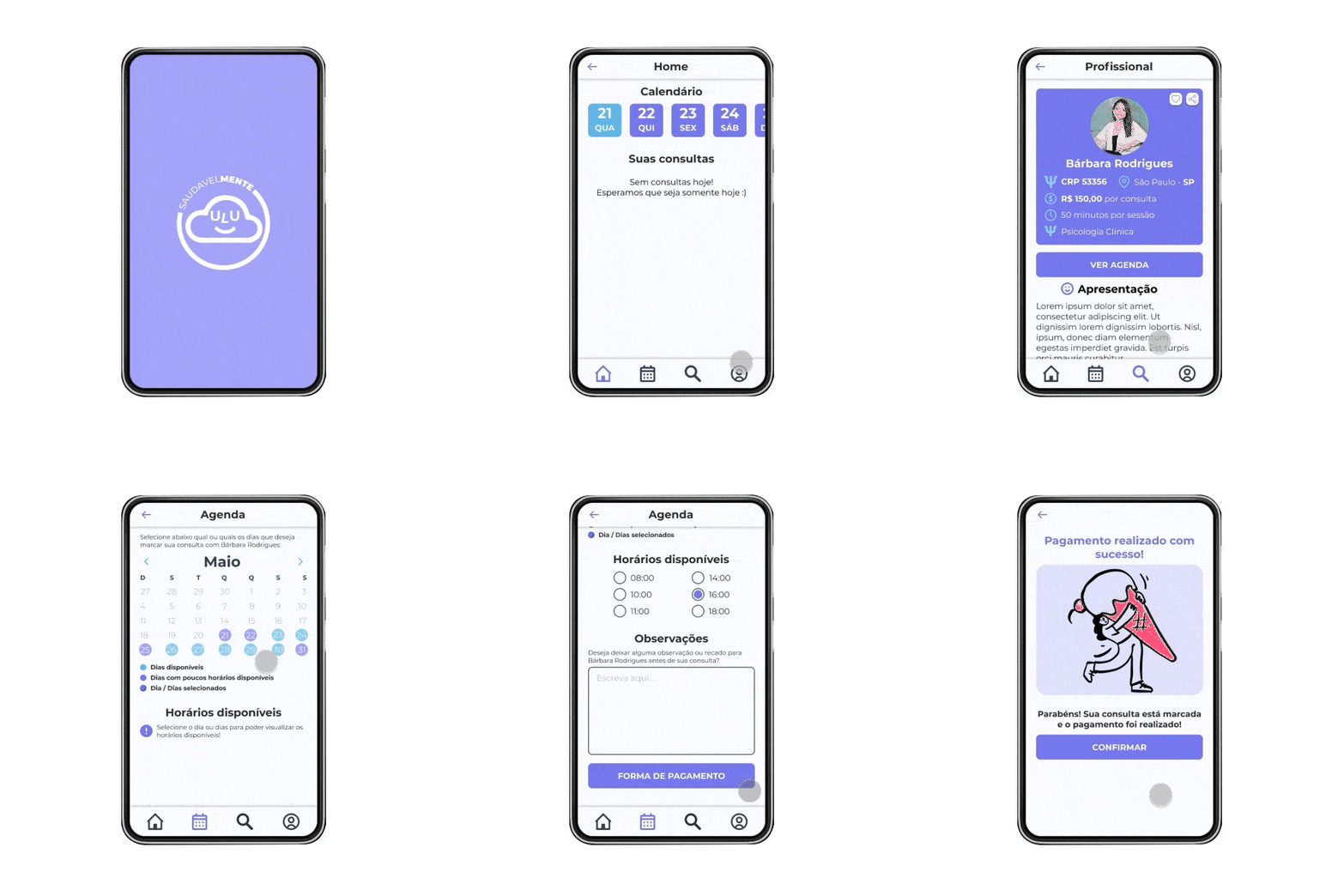
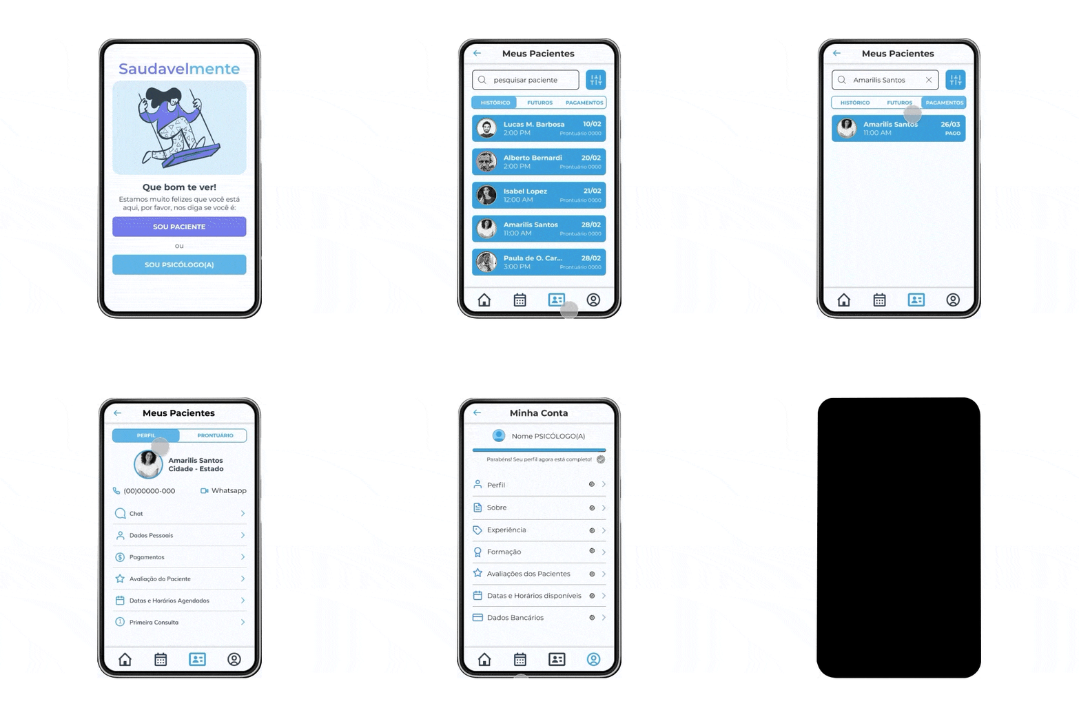
We used the research analysis and style guide to build the high-fidelity prototype. Look how our prototype turned out, after all the settings, in the app navigation video below, or test the final prototype.
Conclusion
We learned a lot from the app by expanding our knowledge of Design and working remotely with five strangers. Each member was essential for the project, some doing more UX Research tasks and others with UI Design work.
Over three months, we understood the process of identifying problems and opportunities. We also learned how to set up a survey and prioritize what parts of the app we should do first. Another significant learning was with usability tests. They showed that we don't know all the users' choices when using a digital product. So, many insights come from the tests.
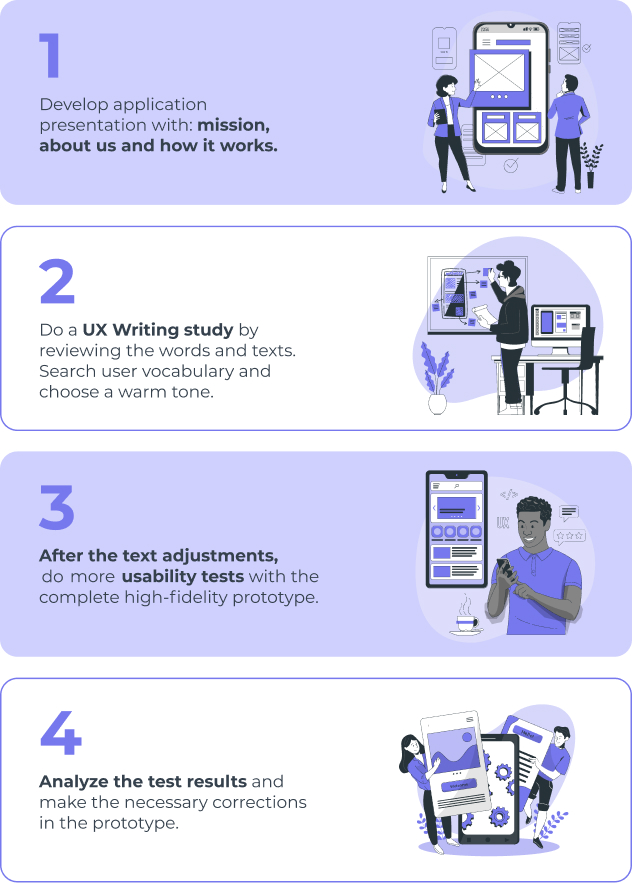
Improvements in the development of the created solution are pending from this project. The figure below illustrates them.
